
VirtuBox Kiosk Design
The brief
In 2020 I joined VirtuBox Infotech on a six-month contract as the only designer on a new product: a self-service kiosk that helps shopping mall visitors find their way and get help. I designed it end to end, from research to every screen, and everything I designed shipped.
VirtuBox Infotech is a SaaS company that builds platforms for apps, websites and kiosks. Businesses buy the platform and build their own solutions on it. The kiosk was a new product line.
The brief was a kiosk that helps mall visitors with anything they need, with navigation inside the mall as its main job. There was also a business need from the start. A kiosk is expensive hardware that visitors use for free, so it had to earn something back through leads, offers and ads. Every decision had to work for the visitor and for the business at the same time.
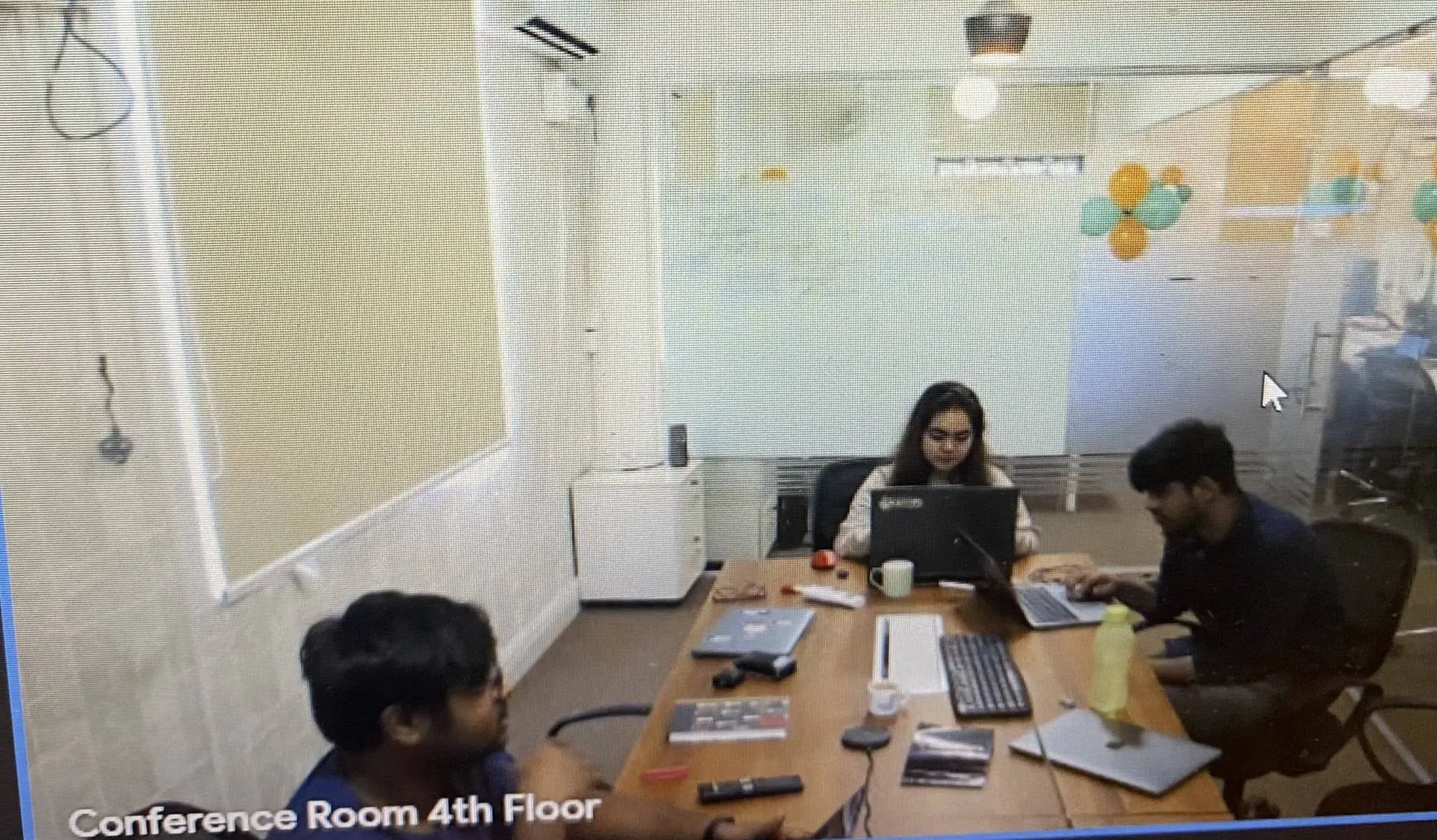
I worked day to day with the product manager, who I reported to. I also joined daily calls with developers and other members of the product team who worked on VirtuBox's other products. I took my ideas and decisions to the product manager, and we discussed the trade-offs together.
Where I started
When I joined, the team had a rough mock-up of the kiosk, not a designed product. It listed everything the mall had as small icons spread across the screen, all the same size. It looked like a keyboard.
Three things stood out to me. Nothing told the visitor what mattered most, so every option competed for attention. The icons were small for a screen people stand in front of and tap with their whole hand. And it had no washroom option at all.
I looked for other kiosks to learn from. In 2020 there were hardly any interactive mall kiosks in India, so I studied videos and information about kiosks in other countries, mostly the US. There was very little to go on. Most of the product's decisions would have to come from what visitors told me.
Interviews
I interviewed friends and other people about problems they had faced in shopping malls. The interviews were qualitative and open: I asked people what problems they had faced in malls in the past. The answers were specific.
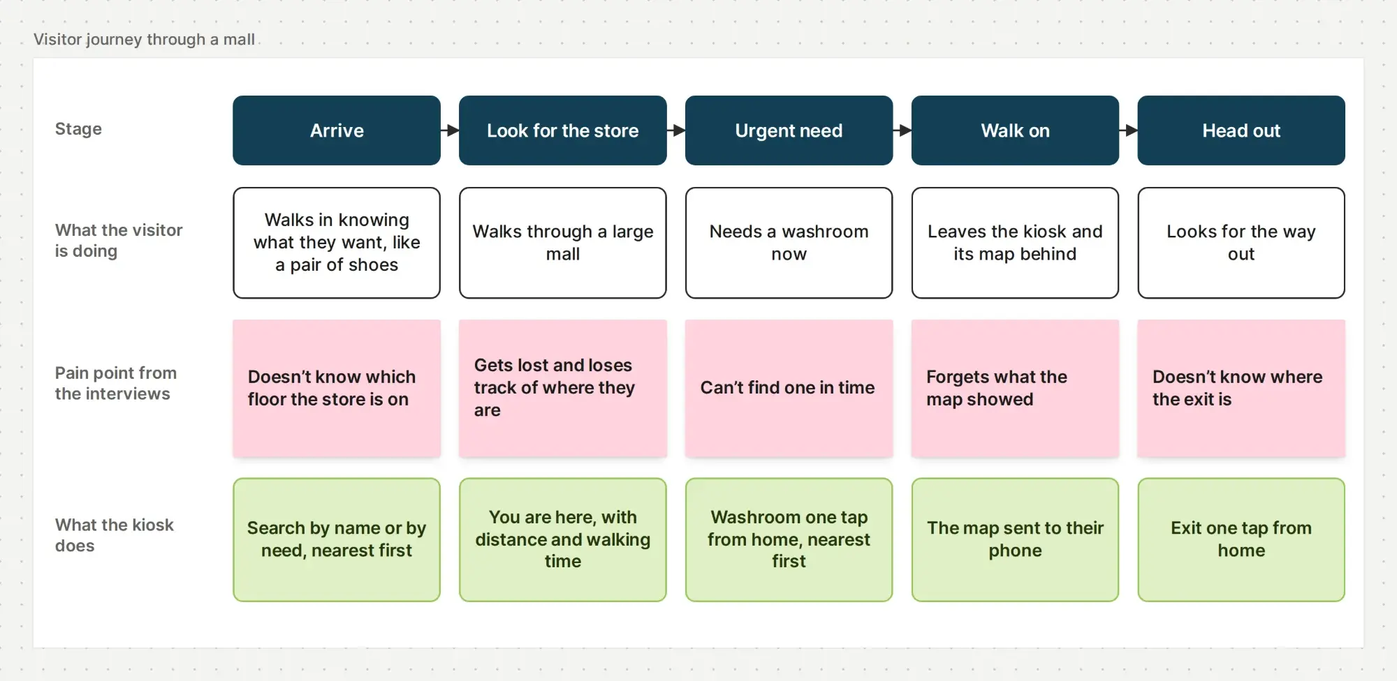
- In large malls, people got lost and could not work out how to find what they wanted.
- People sometimes needed a washroom urgently and could not find one.
- People with little time who knew exactly what they wanted, such as a pair of Nike shoes, still spent a long time finding which floor the store was on.
- People did not know where they were in the mall at that moment, or where the entry, exit and nearest washroom were.
- Once people walked away from a map, they could not remember what they had seen on it.
Most of what I heard was about navigation: being lost, not knowing the floor, not knowing where you are, and not knowing how far something is or how long it takes to reach.
Visitor journey
Laid out as a visit, the findings show a pain point at every stage, from arriving at the mall to leaving it. Each one needed its own answer on the kiosk.
What I took into the design
The research confirmed navigation as the kiosk's main job, and it changed the brief in three ways. Urgent needs like the washroom and the exit had to be one tap away, not buried among the stores. Every location had to come with distance and walking time, not just a position on a map. And the kiosk's help could not end when the visitor walked away from it.
That left two problems to solve together. Visitors get lost and lose time because they do not know where they are, which floor a store is on, or where the nearest washroom is, and a kiosk can only help while they stand at it. The business needed a kiosk that visitors use for free to generate leads and revenue.
User flows
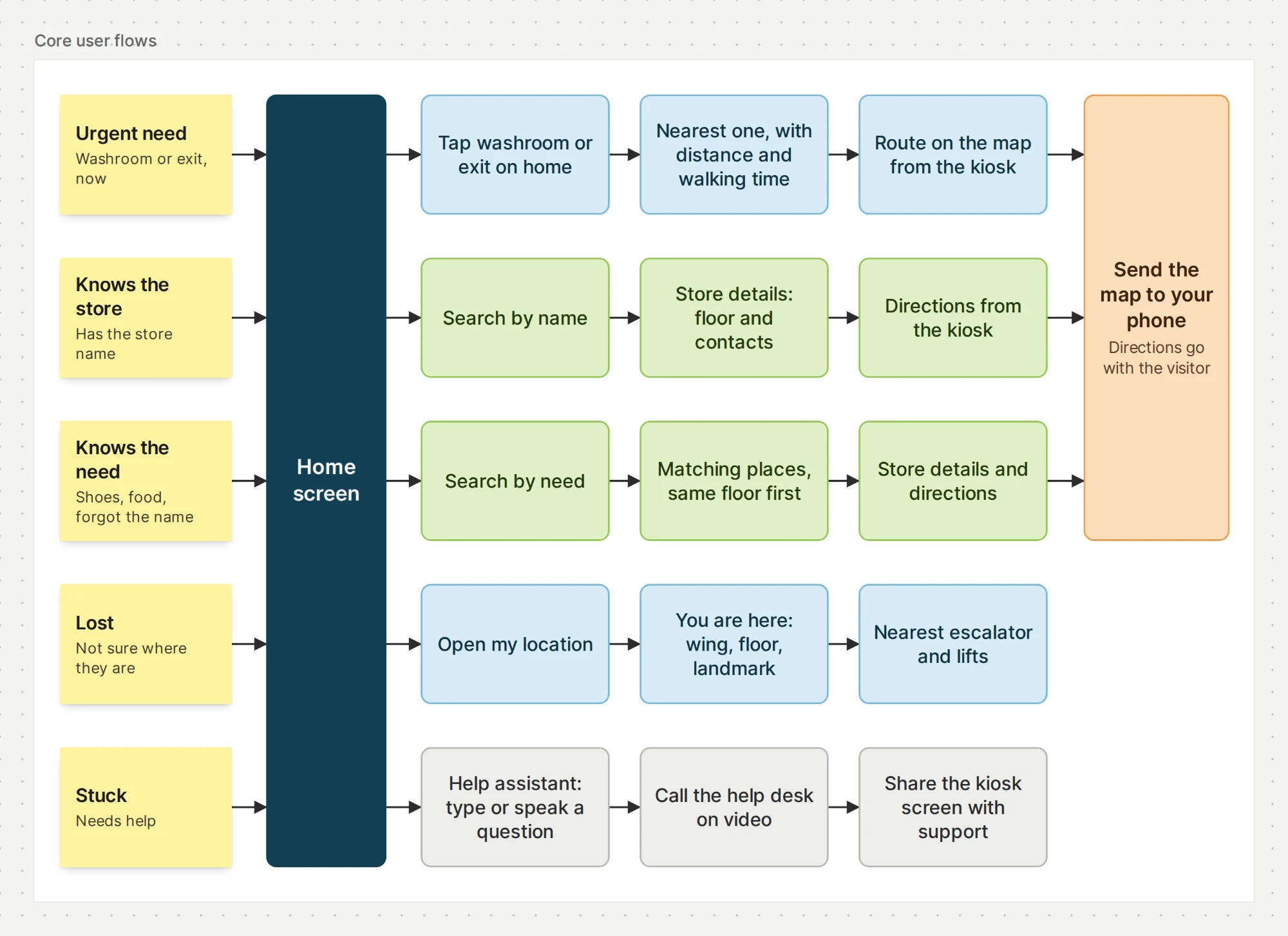
I organised the product around visitors' situations rather than the mall's directory. The first four flows came from the interviews, and the fifth from the brief's aim of solving any problem a visitor has. Each starts on the home screen and ends with the visitor knowing where to go or getting help.
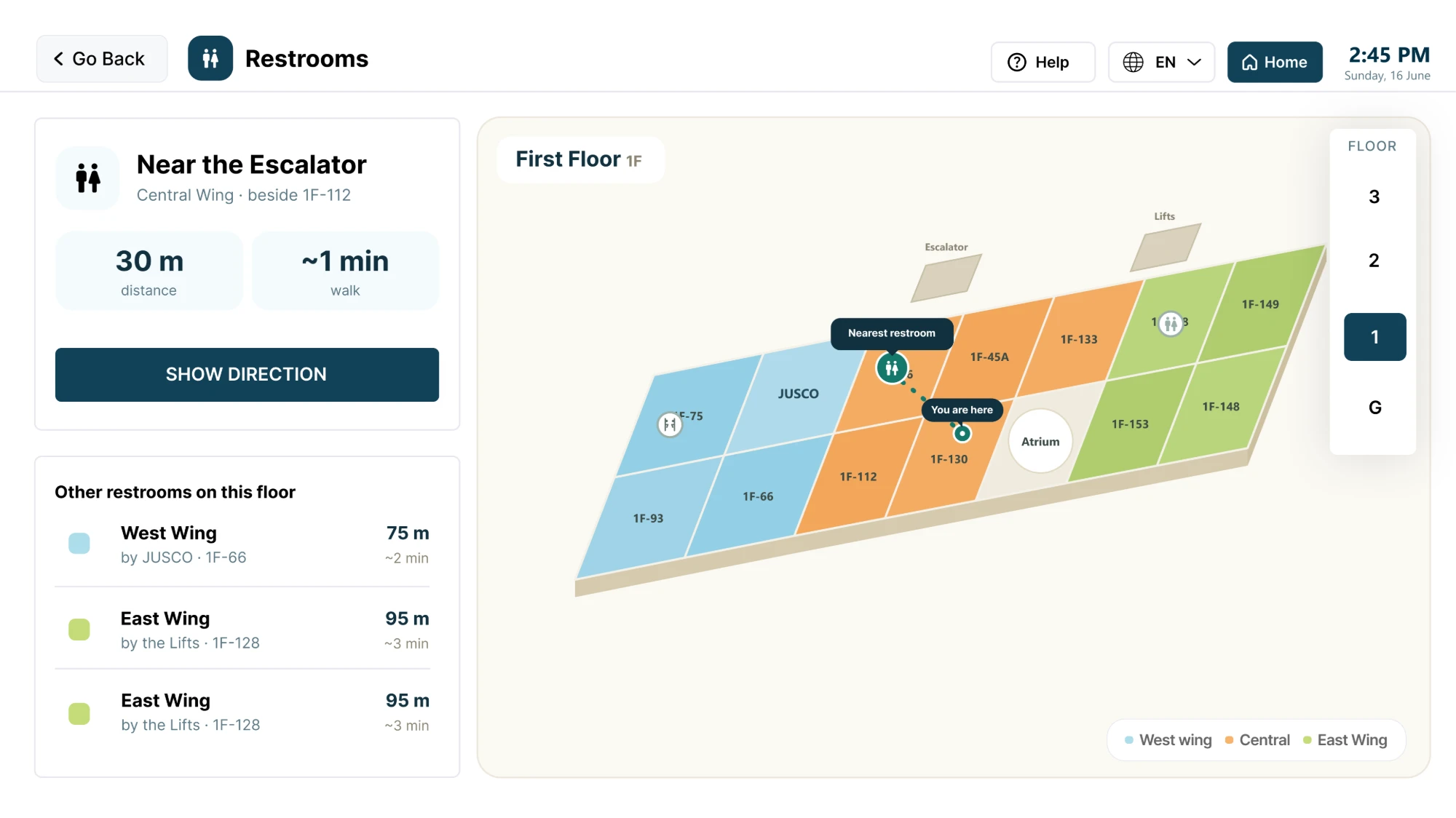
- Urgent need. A visitor who needs a washroom or the exit taps it on the home screen and sees the nearest one, with distance, walking time and directions.
- Known store. A visitor who knows the store's name searches for it, opens the store's details and gets directions from the kiosk.
- Known need. A visitor who only knows what they need, like shoes or food, searches by that need and sees the matching places, nearest first.
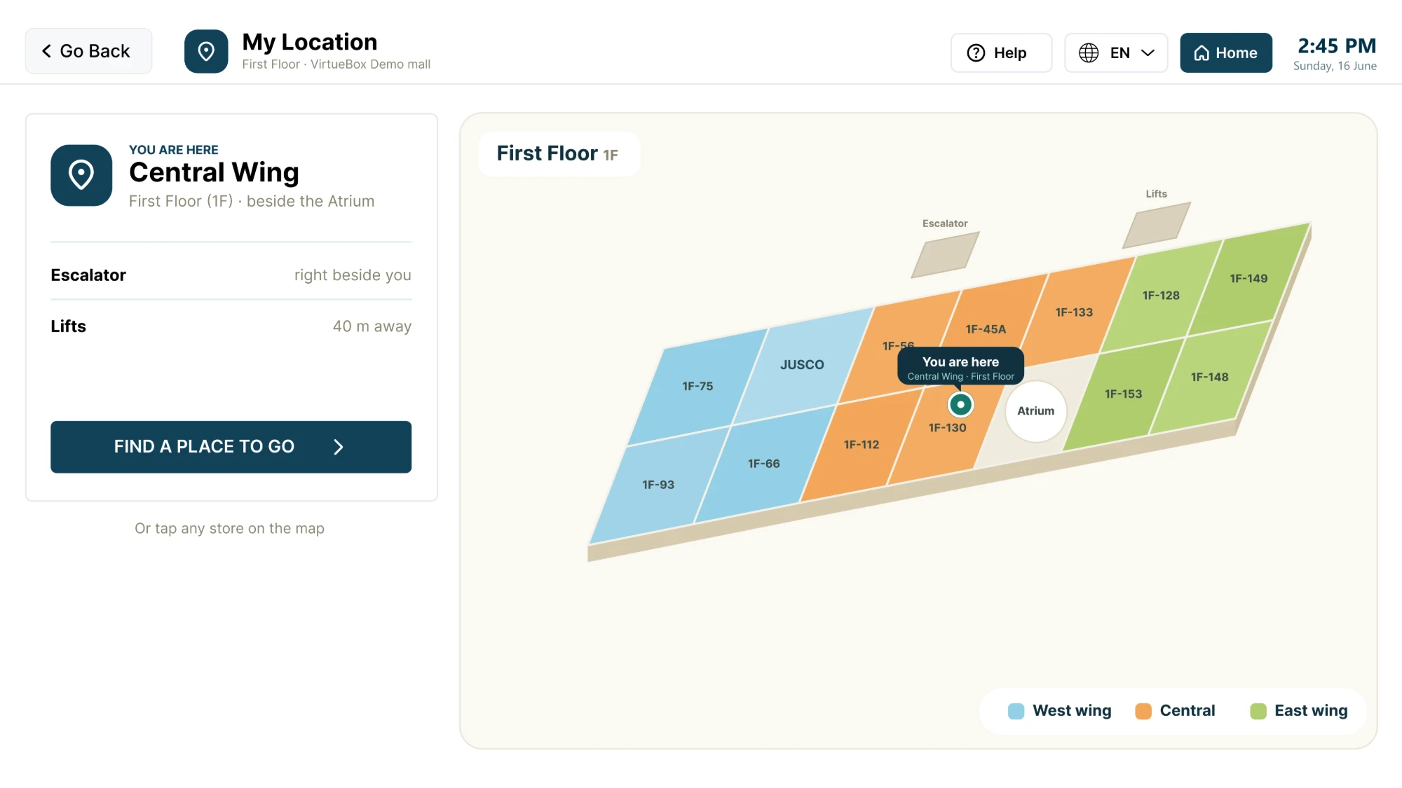
- Lost. A visitor who does not know where they are opens their location and sees the wing, the floor and what is close by.
- Help. A visitor who is stuck asks the help assistant or calls the help desk, and can share the kiosk screen with support.
Flows that end in directions can also end with the visitor sending the map to their phone, so the directions go with them.
Home screen
The starting mock-up treated every option the same: small icons for everything in the mall, all at one size. A visitor had to scan the whole screen to find anything, and the washroom was not there at all.
I replaced the flat grid with a hierarchy. The options visitors need most, and the urgent ones, became larger and sit first. Less frequent options became smaller or moved one level down. I added the washroom, which the mock-up did not have, and made it and the exit one-tap shortcuts on the home screen, because the interviews showed these needs are urgent.
The trade-off was that some options lost space and now take an extra tap. I accepted that, because a visitor looking for a washroom urgently cannot afford to scan a grid of small icons. My manager adopted this version of the home screen.
Search and wayfinding
Search by name and by need
The interviews showed that finding a specific store was one of the biggest problems. But visitors search in two different ways. Some know the store's name. Others remember only what they need, such as shoes or food, and have forgotten the brand or restaurant name.
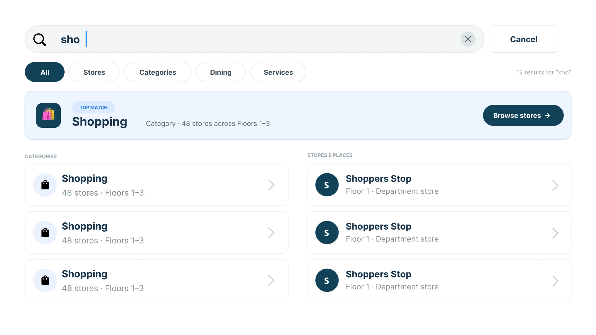
A search that only matched names would fail the second group. Searching "food" would return nothing, because no restaurant is called Food. So I designed search to work both ways: by name, alphabetically, and by need.
A search by need returns every matching place, sorted by distance from the kiosk. Places on the visitor's floor show first, then the rest. Filters let visitors narrow results to stores, categories, dining or services. I worked through how search should behave in discussions with the team.
Store pages
Every store and food place has its own page. It shows where the place is, which floor it is on, and the contact number and email of the store manager or owner. From the store page, the visitor gets directions from the kiosk: where they are now, where the place is, how long it will take to get there, and whether it is on the same floor.
You are here
A kiosk is not a phone. It has no GPS and cannot follow the visitor. It only knows its own position, which the mall sets for each kiosk during installation. So I designed every wayfinding screen to start from the kiosk.
"You are here" shows the kiosk's wing, floor and nearest landmark. The location screen also shows how far the nearest escalator and lifts are. Every distance is measured from the kiosk and comes with a walking time, because time is easier to judge than metres. Visitors in the interviews asked both questions: how far is it, and how long will it take.
Restrooms
The restroom screen shows the nearest restroom first, with distance, walking time and a route on the map. Below it, it lists the other restrooms on the floor with their own distance and time, and a floor switcher lets visitors check other floors. The floor map is colour-coded by wing: West, Central and East.
Sending the map
This was the most important problem in the project. Every distance the kiosk shows is only true while the visitor is standing at it. The interviews showed that once people walk away from a map, they forget what they saw. A visitor who walks off can be lost again.
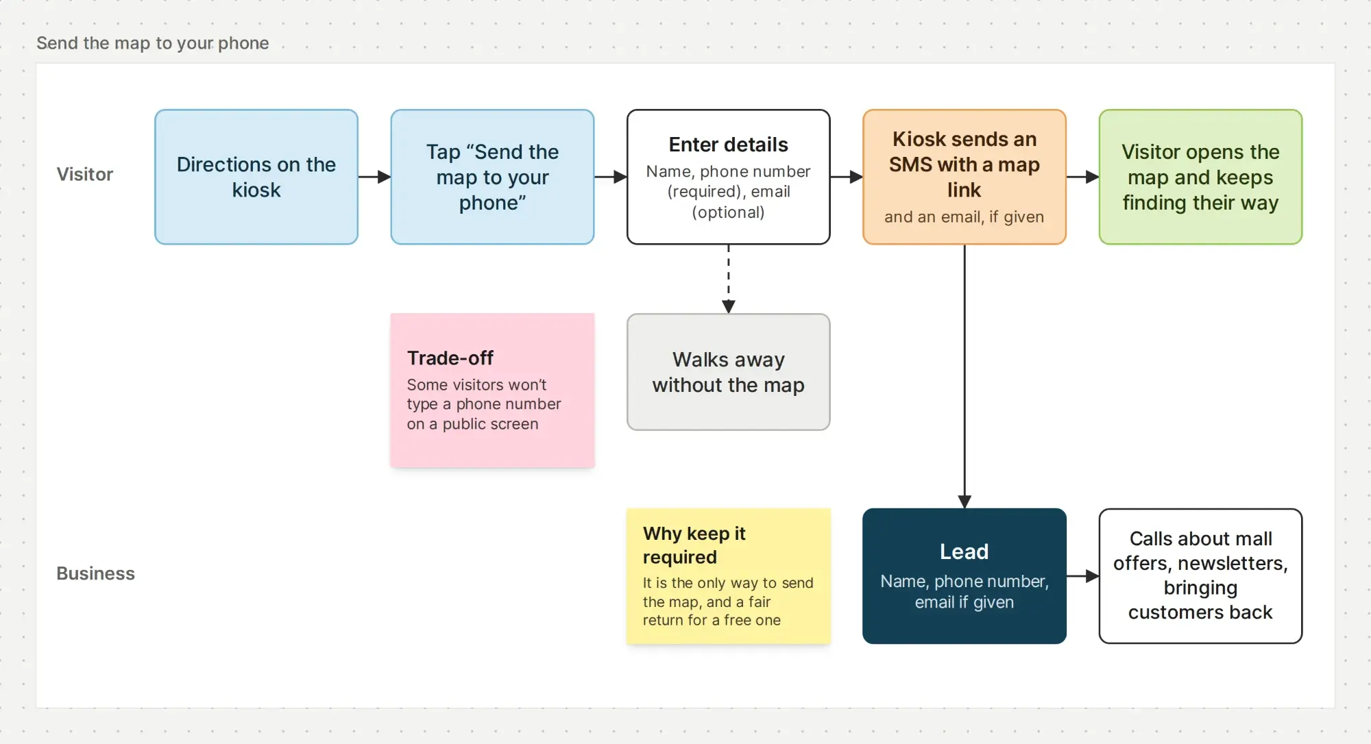
My idea was a "Send the map to your phone" option. The visitor enters their details, and the kiosk sends the map by SMS as a link that opens the map as an image or PDF. If the visitor also gives an email address, the map goes there too.
This was also where the kiosk could generate leads. The details a visitor enters become a lead. The phone number lets the business call later about mall offers, sell products and bring customers back, and the email is used for newsletters. One feature closed the visitor's biggest gap and gave the business the leads it needed.
Why the phone number was required. I made the phone number the required field and email optional. My reasoning was that an SMS reaches a phone without mobile data, while an email needs an internet connection to arrive. A visitor with a working connection could have opened a map app instead.
The privacy trade-off. On a public screen, anyone nearby can see what a visitor types. We discussed the privacy of typing a phone number there. Some visitors would not be comfortable doing that, and would decide they do not need the map. I kept the phone number required for three reasons: it is the only way to deliver the map, the map is free and the number is a fair return for it, and a visitor who walks away without the map costs the business nothing more than one who never asked.
Help desk
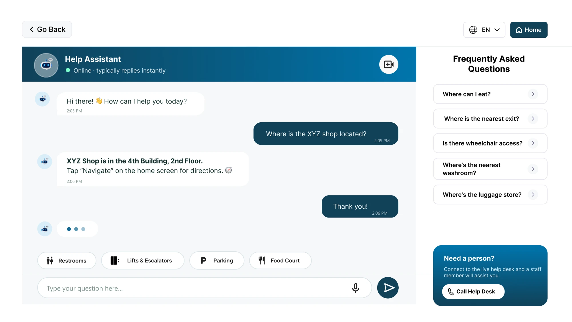
The brief asked for a kiosk that solves any problem a visitor has, so help had to go beyond navigation. The help screen gives visitors a help assistant for common questions, with ready answers for things like where to eat, the nearest exit, wheelchair access and the luggage store. Quick topics cover restrooms, lifts and escalators, parking and the food court. Visitors can type or speak a question.
When the assistant is not enough, "Need a person?" connects the visitor to the live help desk on a video call.
That raised a problem. When a visitor has a technical issue with the kiosk, the kiosk's camera faces the visitor. Support can see the person, but not the screen they are stuck on. On a phone you would switch to the back camera, but a kiosk does not have one.
I designed the camera switch to share the kiosk screen instead. Support sees exactly what the visitor sees and guides them through the fix during the call. Support can see the shared screen but cannot control the kiosk.
Idle screen
My manager asked for moving content that would catch visitors' attention from a distance and draw them over to explore. So the kiosk never goes dark. When no one is using it, it shows offers and ads in an attractive way, which also turns idle time into revenue for the business.
The kiosk also resets to the home screen after a period of no use. On a shared public screen, this means the next visitor starts fresh and does not see the last visitor's search or the phone number they typed.
Testing at real size
I had been designing at web scale. On the kiosk screen, the design did not read correctly at the distance people stand from it. People also tap a kiosk with their whole hand, not a fingertip.
My manager suggested viewing my designs on a TV to judge the real size. Seeing them at that size, I redesigned the entire interface to fit the screen.
My manager also asked me to research standing distance and accessibility for kiosks. What I found shaped the accessibility of the whole product.
Accessibility
A mall kiosk is used by everyone who walks past it, standing or seated, local or visiting. I applied what I found across the product.
- Touch targets sized for a whole hand. People tap a kiosk with their whole hand, not a fingertip, so every control is large.
- Controls within reach. Key controls sit low enough for shorter visitors and wheelchair users to reach.
- Scale for viewing distance. The interface is sized for the distance people stand from the screen, checked on a TV at real size.
- Time, not just distance. Every distance comes with a walking time.
- More than one way to ask. Visitors can type or speak a question to the help assistant, and wheelchair access is one of the ready answers.
Languages
I did not include multiple languages at first. I then got feedback that many visitors to luxury malls are tourists, and the kiosk had to work for them too. I added multiple languages, with the language switch in the header of every screen.
Information architecture
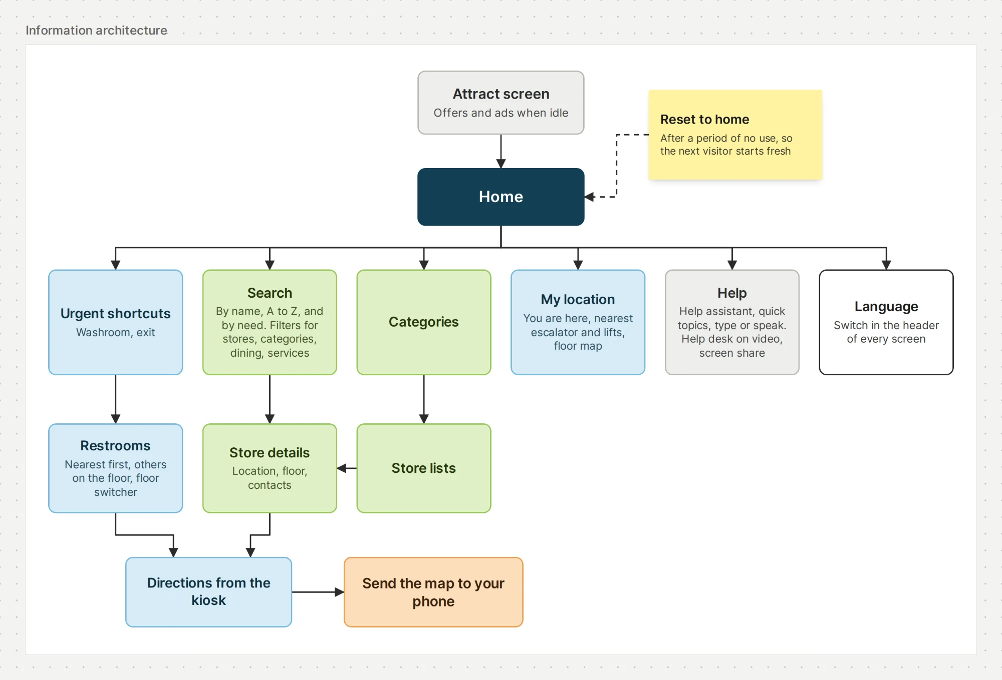
The final structure puts the visitor's situation first and the mall's directory second. Urgent needs sit one tap from home, search and categories lead to store details, and every route can end with the map on the visitor's phone.
What shipped
Everything I designed shipped. I designed it in Adobe XD in 2020. In 2023, before I stopped using Adobe XD, I rebuilt the screens in Figma to keep them, without changing the design. The screens in this case study are that rebuild.
Each problem from the interviews has a direct answer on the kiosk:
- Lost in the mall: "You are here", with the wing, the floor and what is nearby.
- An urgent washroom: one tap from home, with the nearest one, its distance and its walking time.
- A specific store on an unknown floor: search by name and directions from the kiosk.
- A forgotten store name: search by need, nearest places first.
- Forgetting the map after walking away: the map sent to the visitor's phone.
For the business, every map sent to a phone captured a lead, and the idle screen carried offers and ads. I do not have post-launch figures such as usage or leads collected.
At the airport
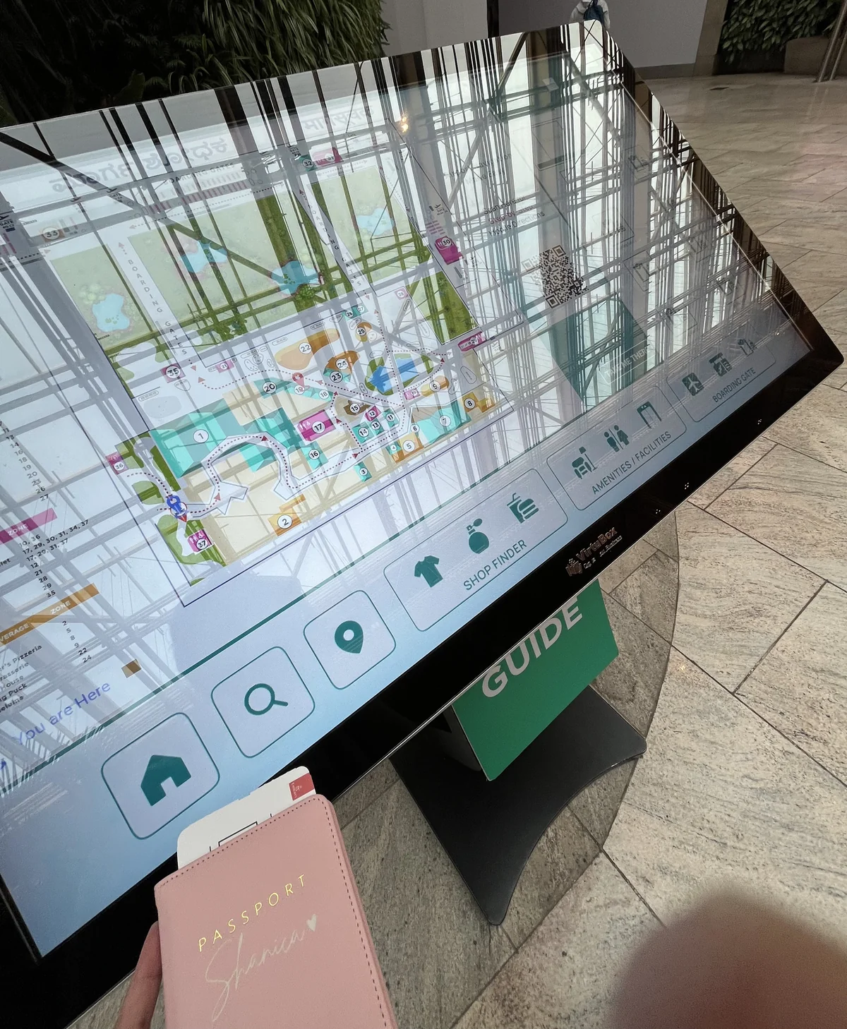
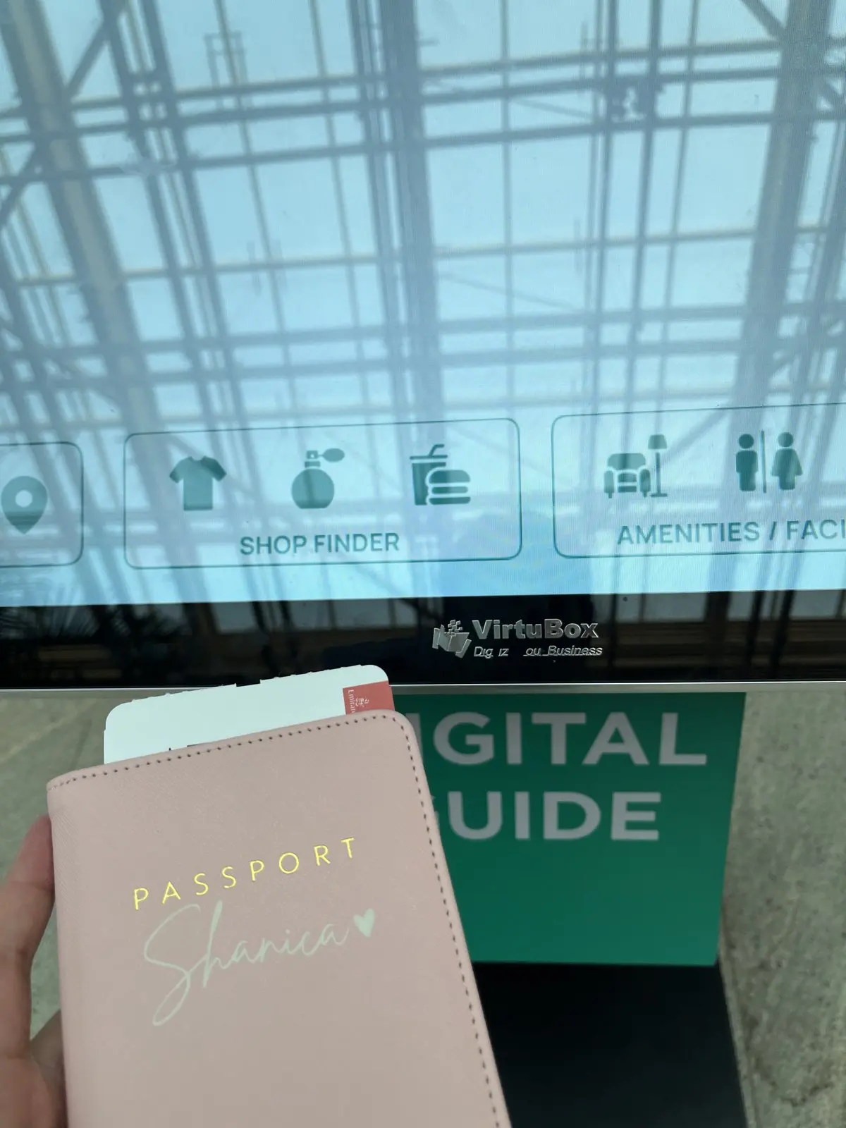
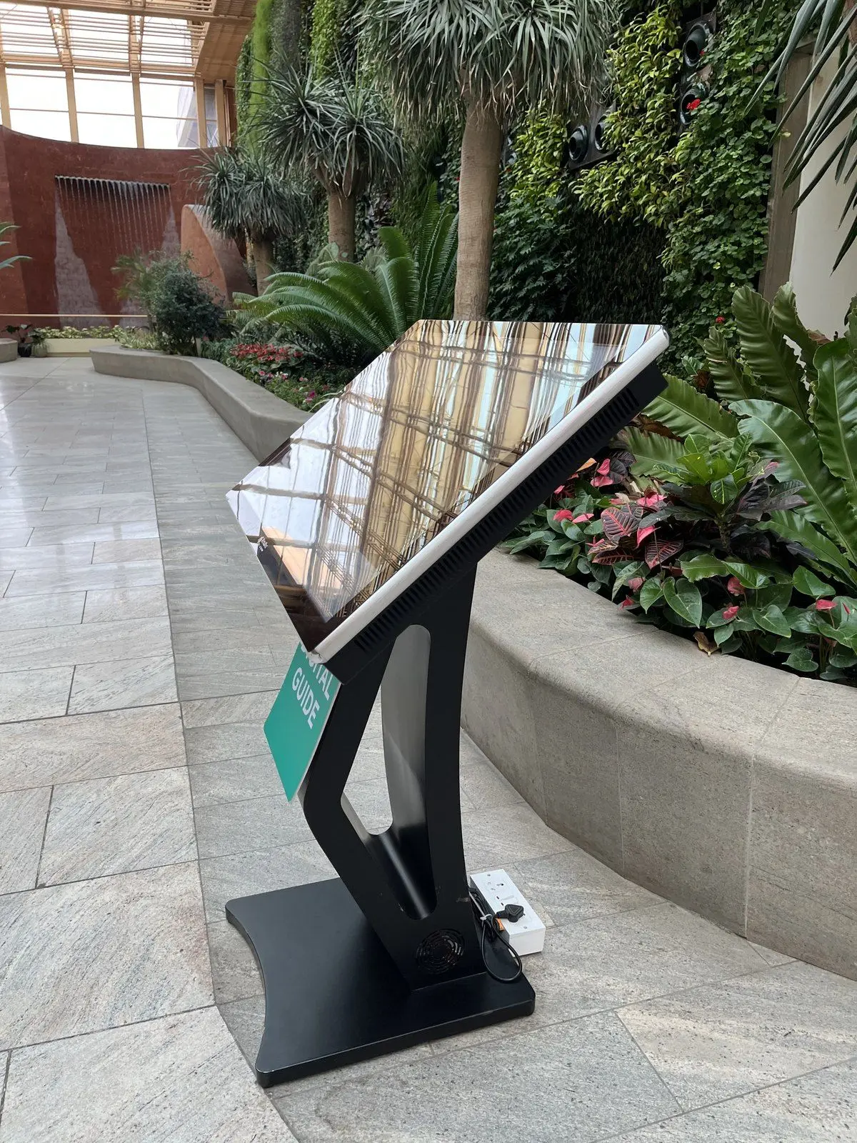
Years later, I came across VirtuBox Digital Guide kiosks at Kempegowda International Airport in Bengaluru. These are set up for travellers, with a shop finder, amenities and facilities, and boarding gates.
Looking back
Seeing my designs on a TV at real size showed me that the scale of a physical product cannot be judged on a desktop screen.
Adding languages after feedback showed me that a public product serves more people than the ones I interviewed, including tourists.
The hardest constraint was that the kiosk cannot move. The answer was to send the directions to the device that goes with the visitor: their phone.